Tutorial
These tutorials describe how to use the maps, adjust visualizations, and compare data across geographies on the Profiles page.
Visualization
How do I change the data displayed on the map?
There are four map views you can interact with on this website: Map by Building Type, Building Size, Building Vintage, and Median Household Income. Navigating to each map will allow you to change different variables.
- From the Bayren home page, select which of the four variables you would like to visualize
OR
- From the Menu in the upper-right corner. Select or change maps under the ‘Map By’ heading.
How can I customize the map?
For each map, use the drop-down options above the map to customize what you would like to see. The following four sections detail which variables are available for each map.
- NOTE: When you make a selection for type of energy consumption (Electricity Consumption, Combined Consumption, and Natural Gas Consumption) or geographical scale (Census Tracts, Census Places, Zip Code Tabulation Areas, and Counties), the website will not remember your selection as you change among maps.
Map by Building Type
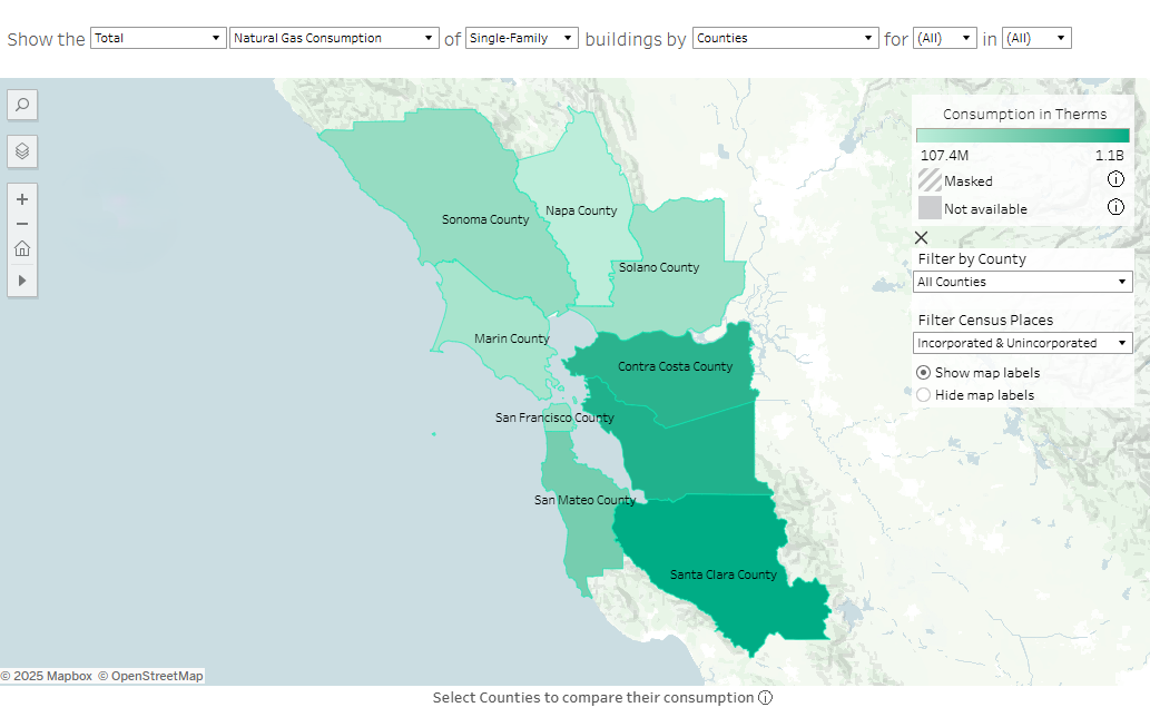
- The left most column lets you select the frequency distribution, by changing to Total, Median, Median per square foot, and Per Capita.
- The second column denotes the energy type: Electricity Consumption (kWh), Combined Consumption (Btu), and Natural Gas Consumption (therms).
- The third column displays the specific building category, which includes the following: Agricultural, Commercial, Industrial, Institutional, Multi-Family, Single-Family, Other, and Null.
- The fourth column displays geographical scale, including Census Tracts, Census Places, Zip Code Tabulation Areas, and Counties.
- The final two columns allow month and year selection. Any combination of months and years may be selected. When multiple months and/or multiple years are selected for a statistical distribution (Median, Median Per Sq. Ft., Per Capita), the values displayed in the map and graphs will show the median of those values for the time periods selected. When Total is selected, the map and graphs will display the sum over the time periods selected.
Map by Building Size
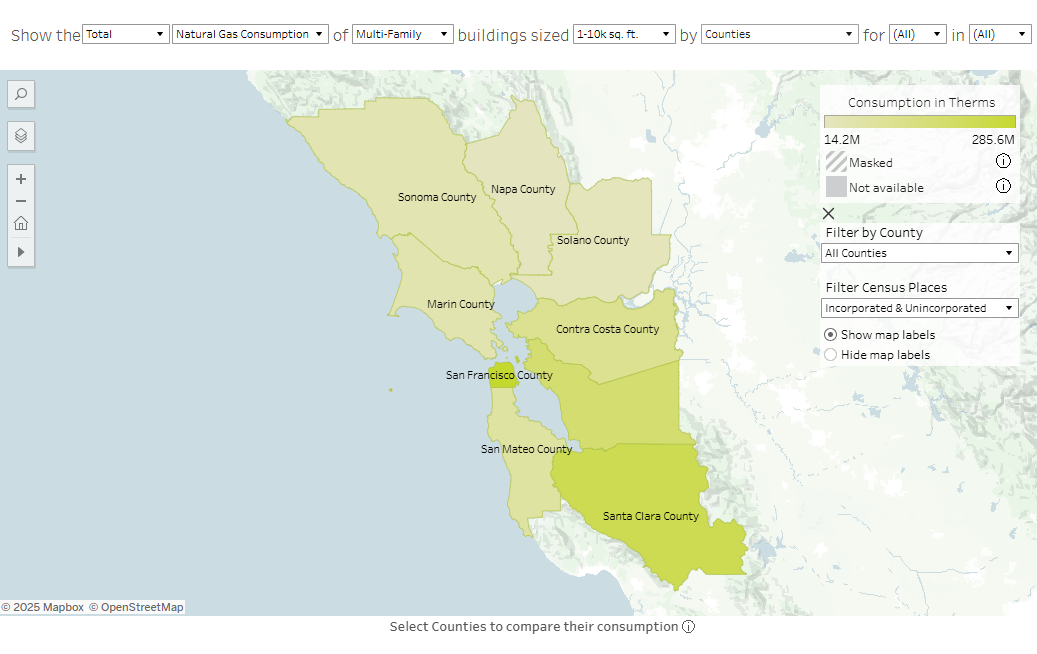
- The left most column lets you select the frequency distribution, by changing to Total, Median, Median per square foot, and Per Capita.
- The second column denotes the energy type: Electricity Consumption (kWh), Combined Consumption (Btu), and Natural Gas Consumption (therms).
- The third column displays the specific building category, which includes the following: Agricultural, Commercial, Industrial, Institutional, Multi-Family, Other, and Null.
- The fourth column allows you to select the building square footage: 0-10k sq. ft., 10k-20k sq. ft., 20k-30k sq. ft., 30k-40k sq. ft., 40k-50k sq. ft., Over 50k sq. ft., and Null
- The fifth column displays geographical scale, including Census Tracts, Census Places, Zip Code Tabulation Areas, and Counties.
- The final two columns allow month and year selection. Any combination of months and years may be selected. When multiple months and/or multiple years are selected for a statistical distribution (Median, Median Per Sq. Ft., Per Capita), the values displayed in the map and graphs will show the median of those values for the time periods selected. When Total is selected, the map and graphs will display the sum over the time periods selected.
Map by Building Vintage
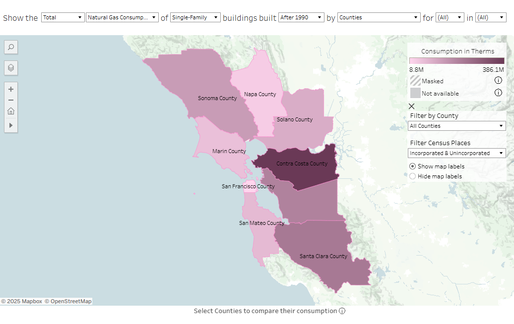
- The left most column lets you select the frequency distribution, by changing to Total, Median, Median per square foot, and Per Capita.
- The second column denotes the energy type: Electricity Consumption (kWh), Combined Consumption (Btu), and Natural Gas Consumption (therms).
- The third column displays the specific building category, which includes the following: Agricultural, Commercial, Industrial, Institutional, Multi-Family, Single-Family, Other, and Null.
- The fourth column allows you to select the time period in which buildings were built: Before 1949, 1950-1977, 1978-1989, After 1990, and Null.
- The fifth column displays geographical scale, including Census Tracts, Census Places, Zip Code Tabulation Areas, and Counties.
- The final two columns allow month and year selection. Any combination of months and years may be selected. When multiple months and/or multiple years are selected for a statistical distribution (Median, Median Per Sq. Ft., Per Capita), the values displayed in the map and graphs will show the median of those values for the time periods selected. When Total is selected, the map and graphs will display the sum over the time periods selected.
Map by Residential Income
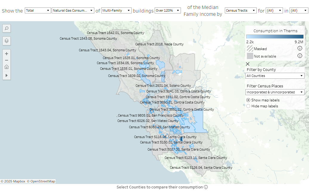
- The left most column lets you select the frequency distribution, by changing to Total, Median, Median per square foot, and Per Capita.
- The second column denotes the energy type: Electricity Consumption (kWh), Combined Consumption (Btu), and Natural Gas Consumption (therms).
- The third column displays the specific building category, which includes the following: Multi-Family and Single-Family.
- The fourth column allows you to select the percentage range of the area median income: 0-30%, 30-50%, 50-80%, 80-100%, 100-120%, Over 120%, and Null.
- The fifth column displays geographical scale, including Census Tracts, Census Places, and Zip Code Tabulation Areas.
- The final two columns allow month and year selection. Any combination of months and years may be selected. When multiple months and/or multiple years are selected for a statistical distribution (Median, Median Per Sq. Ft., Per Capita), the values displayed in the map and graphs will show the median of those values for the selected time periods. When Total is selected, the map and graphs will display the sum over the selected time periods.
Using the Map
How can I interact with the map?
Each interactive map will have shared and unique variables available for adjustment at the top of the window. The options are described in the section How can I customize the map?
In addition to the filter selections available at the top of the map, there is a menu of extra map controls below the legend. When viewing the map, you can use the “Filter Census Tracts by County” dropdown to view the census tracts that lie within the county of interest, as well as the Census Places and Zip Code Tabulation areas that intersect the county of interest. When viewing Census Places, there is the additional option to filter based on whether or not the geography is incorporated or unincorporated.
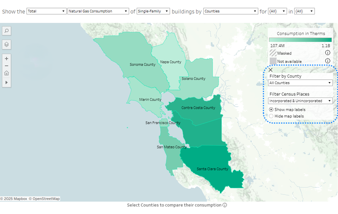
Below the filters is an option to show and hide map labels, which may be useful when examining consumption of the more granular geography levels.
The menu can be collapsed by clicking the “X” on the top left of the Extra Map Controls.
How do I get a data summary and consumption breakdowns for specific regions?
You can get a data summary and see consumption data for a specific geography through any of the interactive maps or go straight to the Profiles page, located at the bottom of the main menu.
In an interactive map:
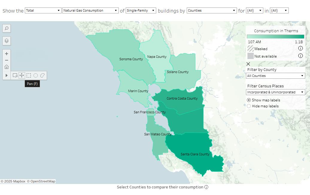
There are two ways to make selections on the map, which can be found in the map control panel on the left of the window.
-
The default option is the “Pan” function, which allows you to move around the map and make selections by clicking on the geography of interest. To select multiple geographies at a time, hold the Ctrl button (Windows) or the command button (Mac) while clicking on the geographies of interest.
-
Use the “Rectangle” option, which allows you to click and drag to make a rectangle. All geographies within the rectangle will be selected.
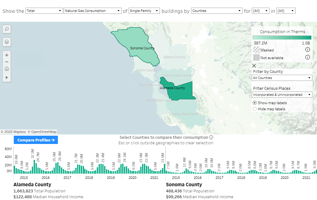
You will see graphical monthly data and a data summary pop up for your selection(s) at the bottom of the screen.
- NOTE: While you can select as many geographies as you’d like, we suggest no more than 3 or 4. Depending on the size of your screen, results may be obscured with larger selections.
To make a new selection, simply click a new geography (without the ctrl or command button) or use the rectangle selection tool. To clear a selection, either Ctrl (Windows) or command (Mac) and click the geography you want to unselect. Alternatively, to clear the entire selection, click anywhere on the map that is outside the included geographies.
- NOTE: If the data summary is available at the bottom of the screen, you have a geography selected. The website will maintain your selection when you navigate to the Profiles page via the Compare Profiles navigation button.
Graph
For each selected geography, the graph in the bottom of the window will show the consumption for each selected month of each selected year. Below the graph, a data summary for the geographies will also be available.
Selections in the graph
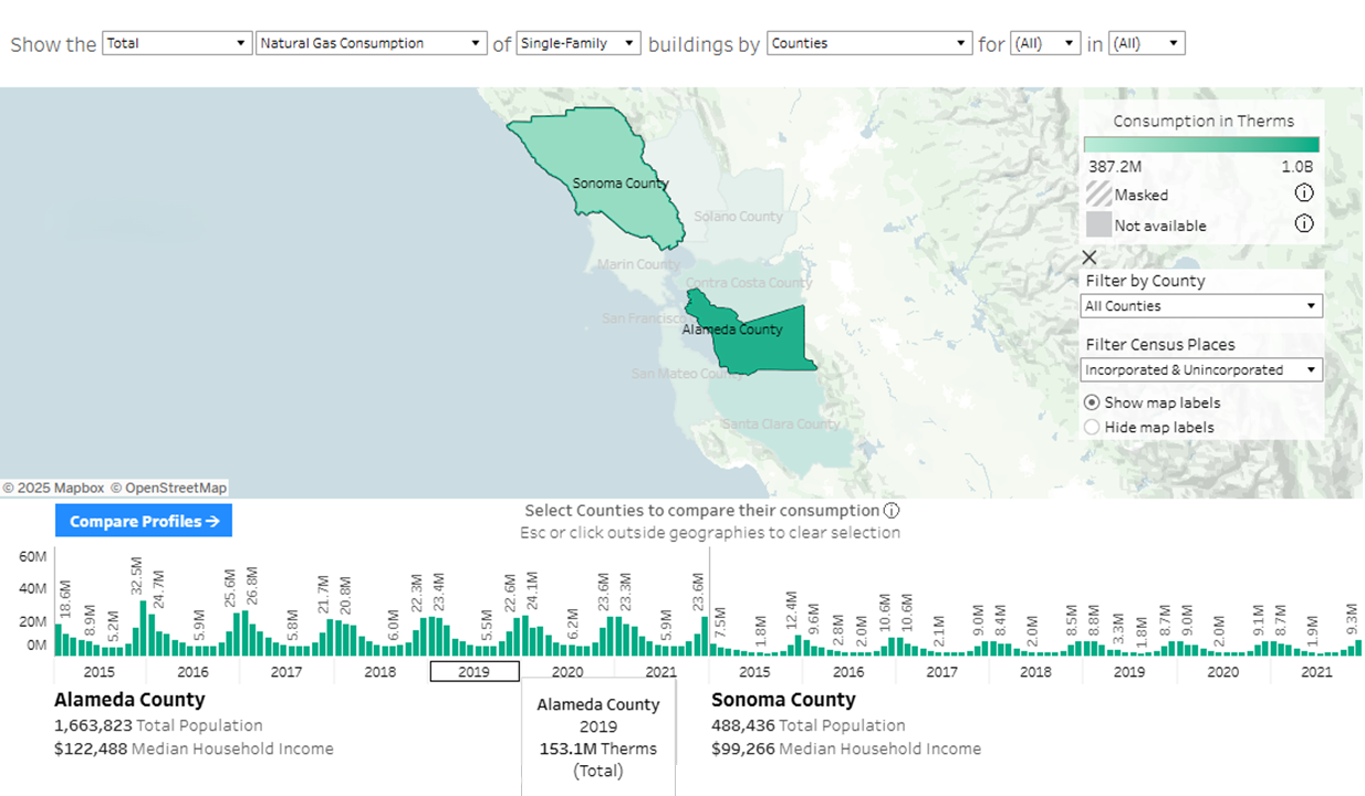
When hovering over the year value in the x-axis of the graph, the aggregate consumption value for the entire year will display in the tooltip.
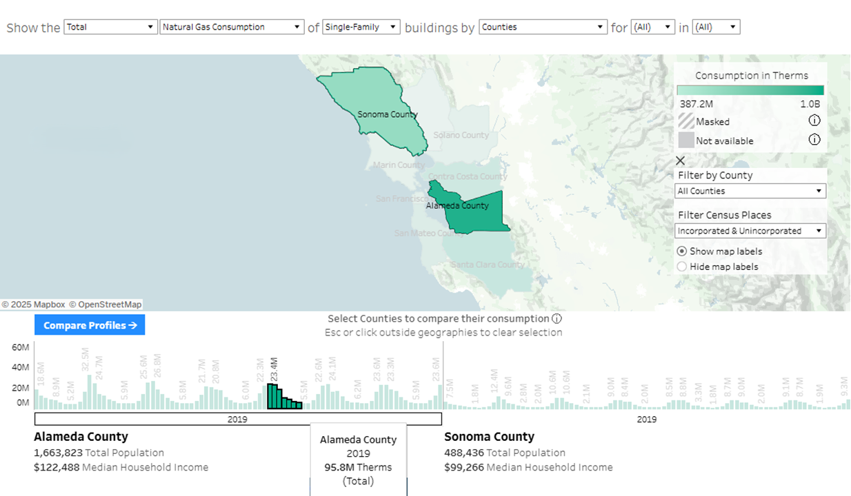
To aggregate specific months and years of interest for the tooltip, you can:
- Click and drag to create a rectangle selection of the months of interest in the bar chart
- Ctrl (Windows) or command (Mac) and click individual months of interest
The selection will filter to only the selected years and update the aggregation displayed in the yearly tooltip along the x-axis of the graph. Even if the selection is made for the graph of a particular selected geography, the dates selected will filter and update for each geography represented in the graphs.
To clear the selection, click on any white space within the graph window or begin a new selection.
Profiles
With at least one geography selected, a “View Profile” or “Compare Profiles” button will appear in the top left of the data summary window, which will take you to the Profiles page with the most recent geography selections (described in the next section).
How do I control the visibility of map layers?
These layers may be toggled using the map controls available on the left side of the map.
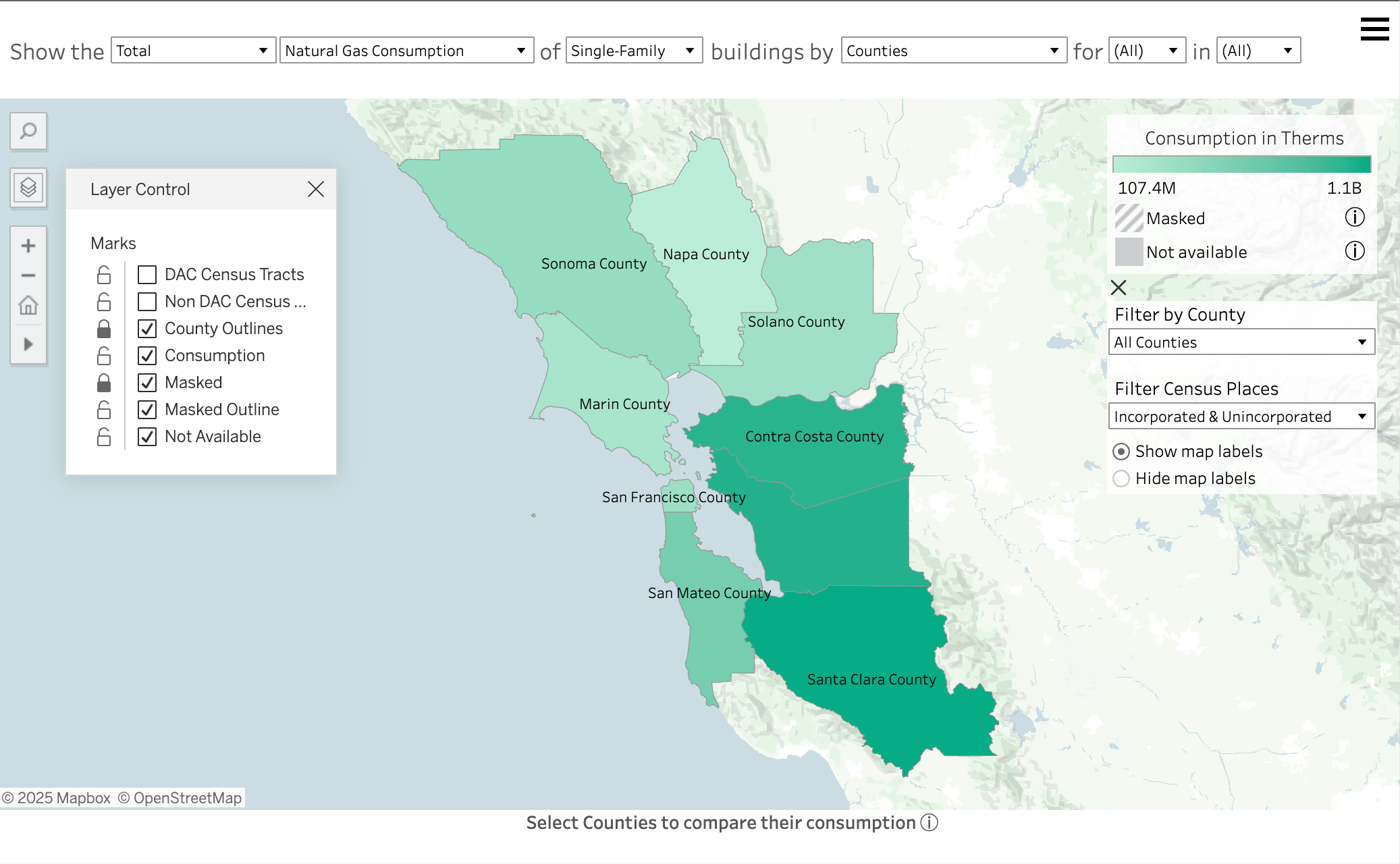
While all layers are technically available to toggle off and on, we recommend maintaining the visibility of the Consumption layer when multiple months and years of consumption data are available. Users will only get accurate information about consumption for the entire time period when the Consumption layer remains visible.
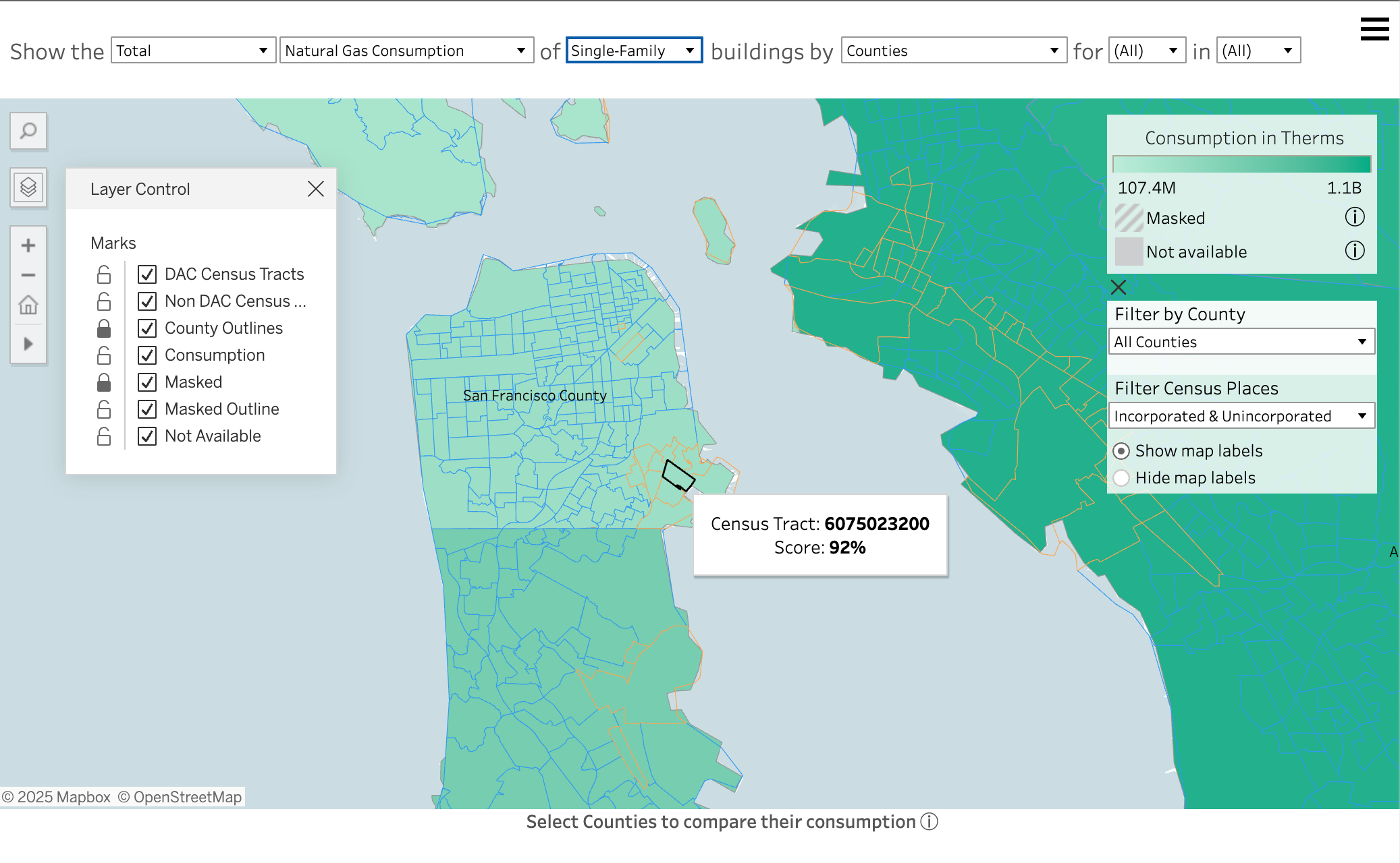
Map layers of DAC and Non-DAC census tracts derived from CalEnviroscreen 4.0 are available as map overlays separately, to increase the flexibility of the layer control.
How do I access CalEnviroscreen scores along with the consumption data?
There are two ways in which CalEnviroscreen 4.0 data are incorporated into the atlas.
-
The first is via the map pages. By default, the CalEnviroscreen 4.0 map layers are hidden. By opening the Layer Control menu in the map menu near the top left of the map area, the option to show DAC geographies (DAC Census Tracts) and Non-DAC (Non-DAC Census Tracts) will become available. These layers are meant for context. Turning them on will prioritize their tooltips on hover.
See How do I control the visibility of map layers for more details.
-
The second is through the Profiles page. The final two graphs of the Profile page provide data on consumption and population per CalEnviroscreen 4.0 score quartiles.
- NOTE: The population graph is not currently available pending a data processing update.
Because Census Places and Zip Code Tabulation Areas do not necessarily align with Census Tracts, these graphs will only populate when viewing Census Tracts or Counties.
Profiles
How do I compare profiles?
If you have selected a geography from a map, and navigate to Profiles page via the Compare Profiles button, all the available graphs and data summaries in the Profiles page will be populated with the selection.
You can also navigate to the Profiles page independently of the map, by using the Menu in the upper-right corner of the window. When you enter the Profiles page without a map selection, the graphs will be unpopulated until a selection is made in the top filters.
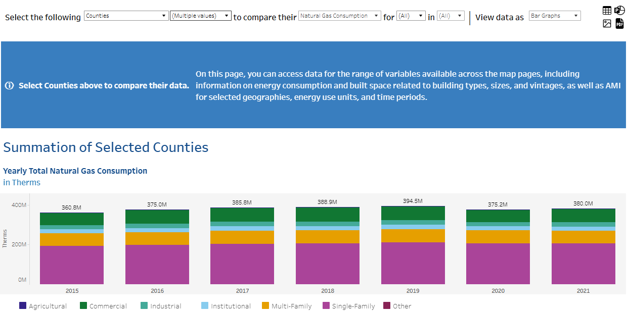
When multiple geographies are selected, the topmost graph will provide energy consumption totals for all of the geographies collectively. This graph will only be triggered with multiple selections. The data below the summation graphs will provide data per selected geography.
- The left most column displays the geographical scale, including Census Tracts, Census Places, Zip Code Tabulation Areas, and Counties.
- The second column allows you to choose specific geographies to compare. This dropdown will update depending on the selected geographic level.
- The next column denotes the energy type: Electricity Consumption (kWh), Combined Consumption (Btu), and Natural Gas Consumption (therms).
- The following two columns allow month and year selection. Any combination of months and years may be selected. When multiple months and/or multiple years are selected for a statistical distribution (Median, Median Per Sq. Ft., Per Capita), the values displayed in the map and graphs will show the median of those values for the time periods selected. When Total is selected, the map and graphs will display the sum over the time periods selected.
-
Finally, you can choose to view the Profiles page data visualizations as bar graphs or as tables.
- NOTE: While you can select as many geographies as you’d like, we suggest no more than 3 or 4. Depending on the size of your screen, results may be obscured with larger selections.
Each graph will have an info button which, upon hover, will provide a description of that graph.
Downloading data
How do I download the data?
For data specific to a current view, users can use the download options available in the upper right-hand corner of the Profiles page.
- NOTE: When downloading a specific view to the Crosstab format directly from the Profiles page, the file will download consistent with the underlying construction of the atlas visualizations. That means the format of the file may require further organization by the user in order to remove elements necessary for the visualizations and perhaps unnecessary for use in a spreadsheet.

-
Crosstab: Opens a dialog window to select download options. If viewing a dashboard, select a sheet from the dashboard to download. Under Select Format, select .csv or Microsoft Excel .xlsx.
For dashboards, all sheets will be listed, including hidden sheets. Any filters, parameters, or selections currently applied in Tableau are reflected in the downloaded crosstab.

-
PDF: Opens a dialog window to select download options. Under Include, select the part of the workbook you want to download. Select this view, specific sheets from a workbook or dashboard, or select all. Select Scaling to control the image’s appearance on the PDF. Select Paper Size and Orientation.
If you’re downloading a dashboard to PDF format, web page objects aren’t included.

- Image: Downloads an image of the view in .png format. Any filters, parameters, or selections currently applied in Tableau are reflected in the downloaded image.

-
PowerPoint: Download selected sheets as images on individual slides in a PowerPoint presentation.
To produce individual images, rather than an image of the entire page, select Specific sheets from this dashboard.
Any filters, parameters, or selections currently applied in Tableau are reflected in the exported presentation. The generated PowerPoint file includes a title slide with the name of your workbook and the date the file was generated. The title is a hyperlink that opens the workbook in Tableau Cloud or Tableau Server.